I wanted to create a business card for my tattoo logo that was interesting and reflected the themes of the studio. I downloaded a few of the mockups that I thought would be interesting for my business card.
I did have one final design that I was happy with that I accidently closed without saving and lost so I had to start again.
I had a couple of rough designs that I was happy with, although I am unsure which one I would use for my final design.

I like the idea of using two different colours for each side of the card, both colours from my colour palette. I think that this will make the card more interesting to look at and stand out more.
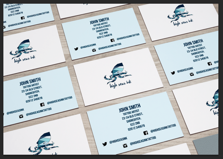
This was my second design. I don’t particularly like the background colours on this as I feel that that they are too light, especially the pale blue. I am also unsure as to whether I like the design on the back of the card with the information on. As the Twitter handle is shorter than the Facebook one I think that it makes the name and address look uneven and not symmetrical (which is something I like). I do, however, like that the logo on the front is smaller than on my first design, although I am not sure why I like this.

This time I changed the colours around for the back of the card so it was more similar to my first design. I prefer having a dark colour on the back as I think that it makes it more interesting. Again, I am not sure about the layout of the contact information.
I did begin to create a square business card, as I found a few images of square ones that I thought were particularly interesting. Additionally, I thought that a square card would make it stand out more and give the brand that edge.

Example of a square business card

The card would be rotated so the square was on an end. I never ended up designing the back of the card as, although I liked the idea, I could never position the logo in a way that was centred on the front. Although with guides and rulers, it said it was centred, I felt that it never looked right and was always more towards one side, which was probably to do with the shape of the logo.