Critical Reflection – Branding

Logo

I like the design and the colour scheme of my logo, and I think that it works well being for a Shoreditch based company. However, I don’t think that it particularly looks like a logo for a tattoo parlour, I would automatically think of something more traditional based for a tattoo logo or that looks somewhat distorted, and has that almost grunge feel that has connotations of tattoos. To start with I wanted to create a very traditional looking logo but I found this particularly difficult to get the drawing right, as I am not an artist by any means. I also wanted to create a logo that could have been a tattoo but again I found this very difficult to do. I do think that my logo works well as a logo, as I think that it is very recognizable and it stands out. The font that I have chosen, I believe, gives it a slightly more tattoo/nautical feel, especially with the colour that I chose. I think that the font looks like clean cut, unlike the logo itself, and so links more to a tattoo studio. In terms of creating a logo for a nautical based company I think that it turned it out quite well, as an octopus is instantly recognizable as an sea creature and so has nautical connotations. Additionally, many people chose to get octopuses tattooed so this also links to the tattoo brand.

Website

Again, I like my website, but I’m not sure whether I like because I like minimalistic, white space designs. I do think that it could work as a tattoo parlours website, as a clean, hipster one, like the Good Times Tattoo website. However, I do think that it has quite a lot of blank space that could have been filled up with something, or the elements already on the page could have been repositioned to fill up that space. I think that it is very clear and the viewer will easily be able to access and use the website. I think that the contact us page works and fills up the space on the page well. The website altogether, in my opinion, could have been more tattooed based, I think I could have looked more into the tattoo industry in itself to find out how different places create logos and websites and brand themselves as a whole. I think that at the moment it looks a little bit like a design company website and not quite like a tattoo one, however I do think that it works, it could just have had a few more tattoo themed elements.
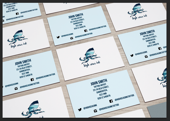
Business Card

For my business card I chose to use two different colours from my colour palette, one of each side. I think that this works very well and is more eye catching. By having the type on the dark blue side a very light blue from my palette it helps it to stand out more and so the information is very clear and easy to read, even at a glance. I am not 100% on the font that I chose to use for the information, although it is clear to read, I am entirely sure what it is I don’t like about, but I could not find another that I liked enough to use instead. Again, I don’t know if it would instantly be recognizable as a business card for a tattoo studio but I think that the information on the back helps.

Colour Palette

I think that my colour palette works well within the nautical theme with the varying shades of blue. Additionally, I think that having the very dark navy and then the very pale blue, these two act as a black and white, without being these two colours.

Overall

I had a lot of ideas at the beginning on this project for a more traditional, tattoo based logo that I wish I had pursued further. I think that these could possibly have turned out better than what I have designed, although I do like my final design. If I had researched further into the tattooing industry I think that I could have created a brand that would have been better suited to High Seas Ink.

Website

I decided to change a few things on  my website after completing my business card. I wanted the whole brand to be very cohesive, for example using the same fonts, colours etc. I didn’t want to use the type that I had used for my brand name on my logo as I felt that this was very stylised and would be harder to read for headers such as ‘Home’, ‘Contact’ etc. I was wanted to keep this as the font for only the company name as it would then be instantly recognizable. Therefore, I chose to do the headers in the font that I had used on the business card. This would link the whole brand together in all aspects. I still kept the paragraph font the same as I had done on my first draft of my website, as the new font I used ‘Bebas Neue’ did not have lowercase letters and I did not want a paragraph of text in all caps as this would be difficult to read. Although in my first post on my website I said that I would not put the headers in one of my colours from my colour palette as it was hard to read, I did this anyways. I felt that as I had changed the font, and this was more bold and clearer, the font and colour stood out more against the background.

Screen Shot 2016-04-21 at 13.19.36

I also decided to make a few more pages to my website.

Screen Shot 2016-04-21 at 13.19.40

Screen Shot 2016-04-21 at 13.19.43

Screen Shot 2016-04-21 at 13.19.46


Mockup of my website home page:

mockup

Tattoo Business Card Ideas

I wanted to create a business card for my tattoo logo that was interesting and reflected the themes of the studio. I downloaded a few of the mockups that I thought would be interesting for my business card.

I did have one final design that I was happy with that I accidently closed without saving and lost so I had to start again.

I had a couple of rough designs that I was happy with, although I am unsure which one I would use for my final design.

Screen Shot 2016-04-18 at 11.30.42


I like the idea of using two different colours for each side of the card, both colours from my colour palette. I think that this will make the card more interesting to look at and stand out more.

Screen Shot 2016-04-21 at 11.28.24

This was my second design. I don’t particularly like the background colours on this as I feel that that they are too light, especially the pale blue. I am also unsure as to whether I like the design on the back of the card with the information on. As the Twitter handle is shorter than the Facebook one I think that it makes the name and address look uneven and not symmetrical (which is something I like). I do, however, like that the logo on the front is smaller than on my first design, although I am not sure why I like this.

Screen Shot 2016-04-21 at 11.46.48

This time I changed the colours around for the back of the card so it was more similar to my first design. I prefer having a dark colour on the back as I think that it makes it more interesting. Again, I am not sure about the layout of the contact information.

I did begin to create a square business card, as I found a few images of square ones that I thought were particularly interesting. Additionally, I thought that a square card would make it stand out more and give the brand that edge.

Example of a square business card

Example of a square business card

Screen Shot 2016-04-21 at 11.53.48

The card would be rotated so the square was on an end. I never ended up designing the back of the card as, although I liked the idea, I could never position the logo in a way that was centred on the front. Although with guides and rulers, it said it was centred, I felt that it never looked right and was always more towards one side, which was probably to do with the shape of the logo.

Website Design

After looking at the other tattoo studio websites based in Shoreditch, I wanted to take aspects from those websites and incorporate them into my own. Below is my design for my website so far.

Screen Shot 2016-04-20 at 21.01.09

I used the minimalistic style that Good Times Tattoo used on their website. I encorporated the logo that I had designed into the website. Other than in the logo I didn’t use the colours in my colour palette, although to start with I changed the colours to one from my colour palette to show the viewer which page they are on. However, I didn’t like this so I changed it to the underline which I think looks a lot better. Additionally, it was hard to see which page you were on as the colour did not stand out from the background.

The website also features the social media links that the viewer can click on to be taken to that page. I used the photograph of a tattoo studio so that the customer would be able to see what the studio looks like and then also some information about the studio. The links at the top allow the customer/viewer to switch between various part of the site. Artists page will allow them to look at the artists working at the studio and the gallery will let them look at the work that has been done there. Studio and contact will let the viewer see a map and the address of the studio and will list all contact details that a potential customer may need.

This is not my final design as I may make some changes to it in the future.


This is another design that I did for my website, although I did not finish it as I wasn’t sure how to fill in the rest of the white space.

Screen Shot 2016-04-20 at 21.59.25