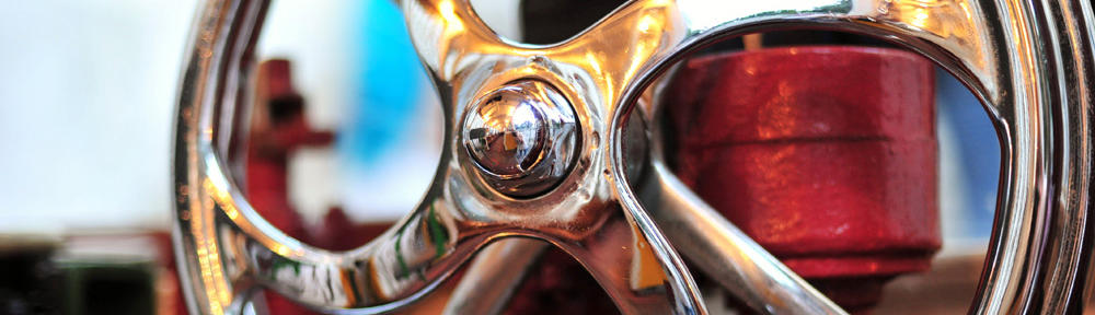
My first ideas wanted to include a nautical symbol that is easily recognized but drawn in a tattoo-styled way. I didn’t want to use an anchor as I felt that this was too obvious for a nautical themed tattoo studio. I looked at nautical tattoos, which can be seen below:
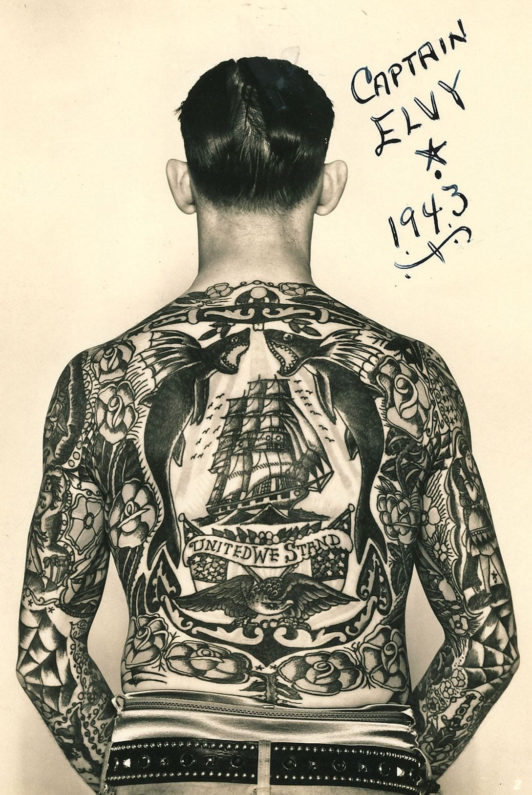


I wanted my logo to look as though it could also be a tattoo – this could show to the customers the quality of the type of work that the studio does. The last photo above inspired me to use a ships wheel and a banner across which would say the name of the company. Below is my original sketch of my first logo:

I then started to transfer this onto the computer by drawing it out on to Illustrator. This was my original drawing in the Adobe program:

This part was the easiest by far – although it wasn’t easy. I made it by creating shapes and lines and then warping them using the tools available in Illustrator. I created a lot of guide lines and grids to make sure the wheel was symmetrical. I am not happy with the inside of the wheel but the banner will cover most of this up and so should not be a problem.
The next stage was to create the banner that goes across the wheel. I made this on one layer and overlayed the text on top of that. I then had to warp the text to fit on the banner and look as though it was printed on it. This was difficult, as I had found on the previous project when I had tried to warp the grid on the space project. This time I used the perspective warp tool available on Photoshop. However, I found it very difficult to get this right and make it look as though it is actually written on the banner. Below is how far I got with it.

When I tried to perspective warp it the top of the ‘s’ and ‘ink’ would get cut off which I did not know how to fix. However, I wasn’t as happy with the digital version of the logo as I was with my original sketch.